EXP02_Week 03_Independent Study
Themes in model:
Sustainability
1) Roof
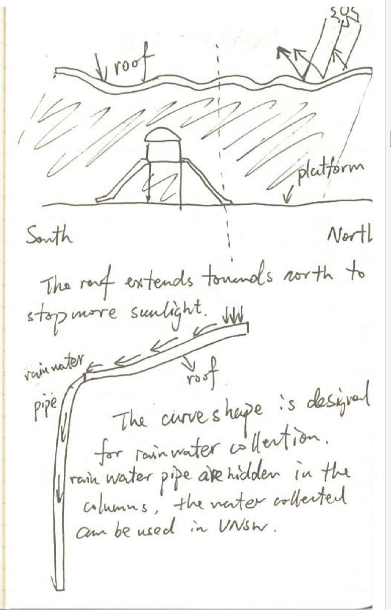
The roof extends towards north to stop more sunlight, therefore the
platform and check-in room can stay under the shadow.
The sine curve shape of the roof is designed for rainwater
collection. The pipes are hidden in the columns which
support the roof. The water gathered can be used for cleaning the road or watering
the grass in campus.
2)
Colume
The arrangement of the column is designed for noise reducing. Light way
can produce loud noise, the columns can stop the spreading of the noise
effectively by increasing the times of reflection.
The arrangement also produces an amazing visual effect. Different position
towards the column may see different pattern. So instead of traditional “subway
advertisement” which hang on the wall (2-dimensions and still), the advertisement
in my station can be dynamic and 3-dimensions. This advance can not only increase
the attraction of the advertisement, but also increase the use ratio of the
column, save the space and material.
3) Skylight
The skylight
allows more natural light come into the building.
Sunlight can
barely get to the south-west facade so this facade of the building is covered
by huge glass to bring more natural light in to the building.
Other consideration in
model:
1) The electroliquid aggregation concept I wrote was: Great
architecture stimulates people to think and reflect, therefore inspires the
society and creates change and transformation. So when I design the
station I spend some time on considering what I don't like about a station. I realize
that 1) I hate to walk in tiny dark tunnel to get to the station or even just
for cross the road. And 2) I don't like stairs. When we walk up down the
stair we have to pay more attention on our foot but not on our mind. Therefore I
designed the huge ramp as an overpass to cross the road and an easier way to get into the shopping center.
2. I also used a lot glass in my design, because I think the use of glass means brightness, and i think students also means brightness, so glass is the best material for a station close to UNSW. And also because the students mainly use the station during day time, so the use of glass can also be environmental friendly because the less use of artificial light.
3) I also design the stairs and check-in machine in yellow, grey and white, because this is the colour for UNSW!!!


Comments
Post a Comment